More Than Just a Wrapper: The Sweet Design Secrets Behind America's Most Iconic Candy Packaging
More Than Just a Wrapper: The Sweet Design Secrets Behind America's Most Iconic Candy Packaging
There's a moment — you probably know the one — where you spot a candy you haven't seen since childhood and your whole body reacts before your brain even catches up. Your hand reaches out. Your mouth waters a little. And honestly? A big chunk of that magic has nothing to do with sugar. It has everything to do with the wrapper.
Candy packaging in America is a wildly underappreciated art form. It's the silent salesperson, the memory trigger, the first bite before the first bite. And the stories behind some of the most recognizable candy designs in the country? They're as rich and layered as a good caramel.
The Color of Craving
Let's start with the obvious stuff that's actually not obvious at all: color. Walk down any candy aisle and you're basically wading through a carefully engineered emotional landscape. Reds and oranges spike excitement and appetite. Yellows feel cheerful and approachable. Deep purples and golds whisper luxury.
This isn't guesswork — candy companies have been leaning on color psychology for well over a century. The bold, high-contrast palettes you see on classic American candy bars weren't born from artistic inspiration alone. They were designed to pop on a general store counter, grab a kid's eye from across a five-and-dime, and burn into memory so deeply that fifty years later, just a flash of that color combination makes you feel something.
Food historians note that early 20th-century candy makers were actually ahead of the marketing curve. At a time when most consumer goods packaging was pretty utilitarian, candy wrappers were already doing emotional heavy lifting — promising joy, reward, and a little escape from the everyday.
The Accidents That Became Legend
Here's where it gets really fun. Some of the most beloved candy packaging decisions in American history weren't decisions at all — they were happy accidents, budget compromises, or last-minute calls that nobody expected to stick.
Take the classic foil wrapping on chocolate kisses and similar bite-sized treats. The original appeal was practical: foil kept moisture out and extended shelf life. But the ritual of peeling that little wrapper, the tactile crinkle, the tiny paper plume sticking out of the top — that became part of the experience. Consumers weren't just eating candy; they were unwrapping a tiny gift to themselves. Nobody planned for that emotional resonance. It just happened, and smart brands held onto it for dear life.
Tin packaging tells a similarly accidental story. Those decorative holiday tins that show up every Christmas — the ones that get repurposed for buttons, sewing supplies, and random batteries for the next thirty years — weren't originally meant to become family heirlooms. They were a practical shipping solution. Tin kept candy fresh and protected during transit. But the decorative printing that got added to make them look festive? That turned a functional container into a keepsake, and people started saving them. Suddenly, a candy company wasn't just selling sweets. It was selling something you'd keep on your shelf long after the candy was gone. That's branding gold.
When the Wrapper Shapes the Taste
Okay, here's the part that might genuinely blow your mind: research consistently shows that packaging doesn't just influence whether you buy a candy — it actually changes how you taste it.
Packaging designers and food psychologists have found that heavier, more substantial packaging makes consumers rate chocolate as richer and more premium. Rough-textured boxes can make dark chocolate taste more intense. And the color of a wrapper? It can shift flavor perception entirely. Candy presented in red packaging often gets described as sweeter. The same candy in blue packaging? People lean toward words like "cool" or "fresh."
This is why a rebrand can feel like a betrayal even when the recipe hasn't changed by a single gram. If a candy company swaps out its classic packaging for something sleeker and modern, longtime fans will swear the candy doesn't taste the same anymore. And in a very real, neurological sense — for them, it doesn't.
The Brands That Got It Right (And the Ones That Learned the Hard Way)
The candy industry has its own version of the New Coke disaster, and most of them involve packaging changes that went sideways fast.
When beloved brands have attempted to modernize their look — streamlining fonts, shifting color palettes, trading a retro illustrated style for something cleaner — the backlash from loyal fans can be swift and surprisingly fierce. Social media has only amplified this. What might have once been a quiet grumble among longtime customers now becomes a full-on Twitter pile-on, complete with side-by-side comparison photos and petitions.
The brands that have thrived over generations tend to share a common philosophy: evolve slowly, and protect the visual touchstones that people have built memories around. A logo might get slightly refined every decade or so, but the core color story stays intact. The font might get cleaned up, but the general vibe remains familiar. It's a delicate balance between staying relevant and honoring the emotional contract a brand has with its fans.
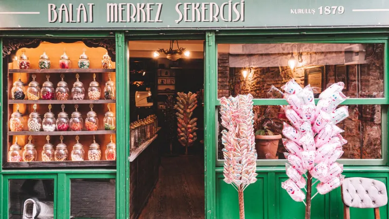
Conversely, the candy companies that have leaned into their vintage aesthetics — deliberately preserving retro packaging elements or even releasing limited throwback editions — have found that nostalgia is basically a superpower. People will pay a premium for the packaging that reminds them of being eight years old in their grandparents' living room.
The Artisan Angle
It's worth noting that independent and artisan candy makers have taken a lot of these lessons to heart in a really exciting way. Small-batch chocolatiers and confectioners across the US are putting serious thought and craft into their packaging, treating it as an extension of the candy itself rather than an afterthought.
Hand-illustrated wrappers, letterpress-printed boxes, wax seals, and thoughtfully chosen color palettes are showing up in candy shops and at farmers markets from Brooklyn to Portland. These makers understand intuitively what the big brands figured out over decades: the unwrapping is part of the eating. The package sets the mood before a single piece of candy ever hits your tongue.
Every Wrapper Tells a Story
Next time you tear into a candy bar or pop open a tin of hard candies, take a second before you dive in. Look at the colors. Feel the texture of the wrapper. Notice the font choices and whatever little illustration or logo has been living on that package, possibly unchanged, for decades.
Somebody made a hundred decisions — and maybe stumbled into a few happy accidents — to create that exact moment for you. And somewhere along the way, it worked well enough that you keep coming back.
Life really is sweeter with every bite. But sometimes, the sweetness starts before you even get the wrapper off.